By Harlan Nemers
Although Ryerson’s rebranding process started nearly a year-and-a-half ago, the final product has just been revealed this week.
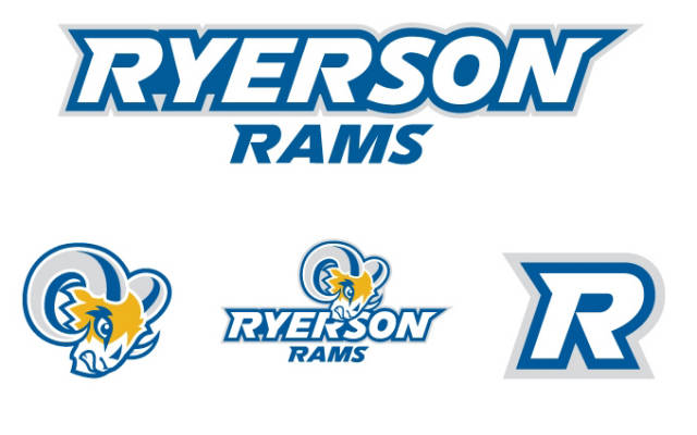
Ryerson University Athletics and Recreation unveiled the new Ryerson Rams logo this week in conjunction with the 2011-12 season. The new logo incorporates Ryerson’s official colours — blue, gold and white — etched onto a much fiercer looking ram.
“When we wanted to update the logo, we wanted to make sure that we bought our brand in line with the University in terms of what the kind of school we are,” said Stephanie White, Associate Director of Athletics at Ryerson. “We are a downtown hip, energized school. We wanted to make sure we brought that feel.”
“We did want to change the feel of our own athletics brand to be a more professional brand, for example the new ram is more bold and aggressive.”
The CIS teams will all be getting new uniforms this season, with Saturday night’s men’s basketball game against the Baylor Bears being the first time a team to wear their new jerseys.
“One of our goals was to add more spirit in the brand and in the logos. We really wanted to make a logo that would make people proud to wear — whether they’re an athlete or whether they’re supporting the team.”
Last season was a successful one for Ryerson Athletics, as the men’s soccer team and both basketball squads made it deep into the playoffs while the women’s hockey team achieved OUA status for the upcoming 2011-12 season.
“I think the rebranding helps the support for championship teams,” said White, who coached the women’s hockey team last season.
“It’s important that you feel proud about the uniform you wear when you compete in any sport,” said White.
Photo: RyersonRams.com


Leave a Reply