By Desiree Amani
The soft launch of the Ryerson Student Learning Centre (SLC) definitely made an impact on student life. The collaborative and private spaces give way for all student types to study hard, just in time for finals. The building’s themed floors drew many in, but already there seems to be a clear student favourite — floor six, the beach.
A survey of 360 Ryerson students shows that 46 per cent of the student body prefers the beach floor over all others by a large margin; the second favourite floor, the sky, had only 26% of the votes. So, what gives this floor its incomparable popularity?
Michael Cotton, project manager for the RSLC, explains that the attraction stems from how diverse the floor can be.
“The idea of a beach was chosen as a point of inspiration because of the gradual sloping of the floor towards a view, and because of the way people spend time at the beach: alone or with friends, relaxing on the sand, reading a book or something more active. The Beach at the SLC is meant to be very versatile, with uses not yet foreseen. Volleyball anyone?”
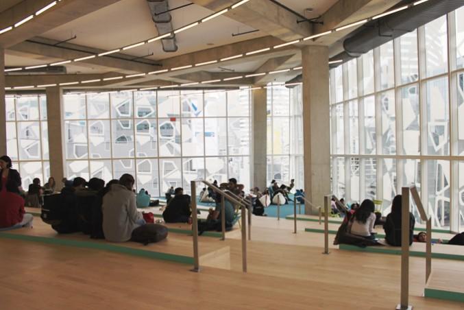
While there are yet to have been nets set up (how fun would that be though?), the floor captures the beach atmosphere in many ways. There are the sky-high ceilings that provide lighting like a mid-July sun, so immense that you might break a sweat!
The sand-coloured wooden floors are so realistic that you might actually be able to imagine the feeling of cool sand between your toes… you know, if it weren’t for the fact that you’re probably still wearing winter boots. We can still dream though right?
Finally, the blue carpeting at the bottom of the floor looks clear and swimmable, for those who want to take the extra plunge.
The furniture also emulates the seaside theme. There are beach chairs in an assortment of vibrant colours scattered all over the floor. For the more relaxed beach goers, there are also body-shaped and bean bag chairs, perfect for enjoying some soft serve in. Don’t forget the killer view provided by the floor-to-ceiling windows that lets in lots of sun so you can soak up some rays while studying (or napping)!
Maryann Adas, a third year interior design student, enjoys the space and attributes its popularity to its versatility, a feature that the designers aimed to have. “I like it because you can make your own little bubble,” said Adas. “The furniture’s flexible and there’s no fixed seating.”
First year professional communications student Micheil Rothwell felt similarly about the floor, also noting how it may be uniting the Ryerson community. “It’s really comfortable and it’s relaxed with really good lighting, and I feel that it brings students together because it doesn’t matter what program you’re in. It isn’t a program-specific area; everyone can come in and work. There’s space for everybody.”
However, not all share this positive view. Faezeh Ehsani, also a third year interior design student, sees major functional flaws in the layout of the floor. “I think it’s just such a waste of space,” Ehsani insisted. “It could have been designed better for people to use it as a functional seating space where they have more privacy.”
“I get it that it has to be a communal space and that’s why they designed it this way, but when you look at the space you see that people need their personal areas, so there are gaps that are wasted.”
Love it or hate it, you’re sure to see the number six illuminated in the elevator (that you probably waited ten minutes for) every time. So put on some sunscreen, crack open a cold one (discretely), and enjoy!
After all, life’s a beach.


Leave a Reply