By Dan Darrah
Ryerson spent $200,000 on a new brand in August, including a font and colour update.
The rebranding consisted of an extensive consultation process including eight focus groups, six round table discussions between undergrads, graduate students and alumni, over 8,000 surveys, 40 one-on-one interviews as well as a competitive review of other universities.
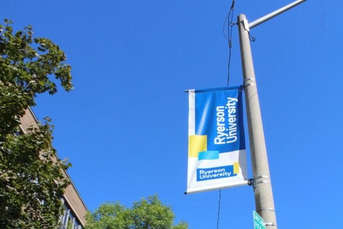
The result was an updated logo — the new marque keeps alive the traditional Ryerson blue-and-gold palette while employing a new “bold, sophisticated and innovative” font – and a new vision, which envisages the university as a fostering “inventive and purposeful thinkers and creators.” Much of the brand’s ideas and strategies echo Ryerson’s “Our Time to Lead” – the 2014-2019 academic plan released last year.
“I think the Ryerson re-brand has been received very well from what I’ve seen and I love the way the banners look and I like the colours,” said Ryerson president Sheldon Levy.
While the university has already spent $200,000, additional costs will be incurred after the brand’s “creative execution.”
“Building signage is one of the more challenging pieces to update and therefore will happen at some point the future when they need to be renewed or replaced,” said Erin McGinn, Ryerson’s assistant vice president, communications, government and community engagement.
The creative execution is penned as a strategy to provide a “much more unified approach to communications that will distinguish Ryerson from other institutions.”
To the chagrin of the administration, however, some students are expressing discontentment with the usage of school funds.
“It looks like they took the old logo, then broke it,” Josh Gonsalves, a student in RTA, said.
“Could the $200,000 not have been spent in a more beneficial way? Does a logo take priority over other important issues?” Kristina Kramer, a social work student, said.
“Uneducated decisions, such as spending an obscene amount of money to paint the campus roads yellow and blue, should not be made this easily by an educational institution,” she continued.
McGinn addressed the possibility of such critiques saying, “The brand is more than a font or a logo — it’s about our tone, manner, messaging, imagery, photos, graphic elements, typography and colour palette.”
McGinn also noted that the logo was “based on research and input with students and potential students“ and that the diversity of the student body was not only “well represented but also heard.”
After 20 years of “growth,” it was finally time for the university to refresh its look, creating a “brand framework to reflect all of the great changes at Ryerson,” she added.
The creative execution of the brand is planned for the end of September 2015.


Leave a Reply