By Jacob Dubé
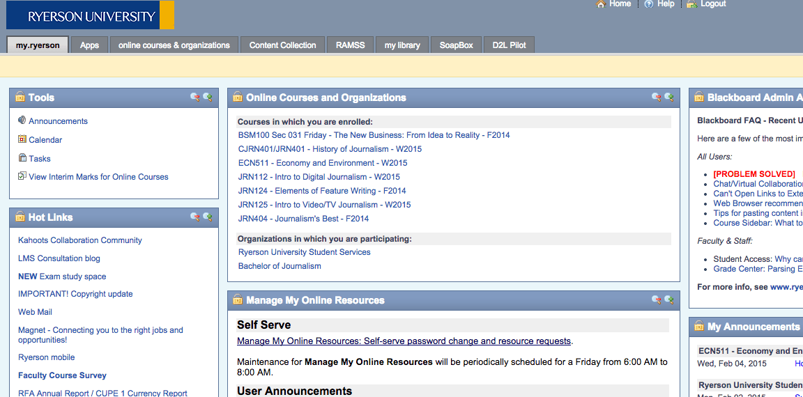
The Computing and Communications Services (CCS) at Ryerson will be implementing a redesign of the my.ryerson portal on Friday from 6 a.m. to 8 a.m.
“Only two pages are changing. The landing page, and the first page you get when you log in. The changes are primarily look and feel, and reorganizing the content, so that things that are similar are together. They’re not spread out; they’re grouped together more. That’s to try and make it more logical and useful,” said Jim Buchanan, Assistant Director of the CCS in charge of client services.
The CCS brought in the Toronto-based consulting company Usability Matters to review my.ryerson and identify some problems linked with the portal. They found a number of issues, including a lack of information hierarchy and the pages being visually cluttered.
“My.ryerson was introduced in 2003 and hasn’t really undergone any change since then, it’s just kind of evolved. We started talking about it years ago. We started talking about the fact that it needed to change,” said Buchanan.
The change was planned for November 2014, but was rescheduled due to technical issues.
The redesign is not just a one-off. The CCS plans to gradually make changes to the portal while receiving feedback from students and faculty.
“We like to do a little bit. Then do a little bit more. Get some feedback. Do some tweaking. Do a little bit more. So we’re looking for people to tell us what they think we should do. We’re very open to suggestions,” said Buchanan.


Leave a Reply