
By Joel Wass
A good sign of a great sign is simplicity, says a political campaign expert.
“People only spend a split second looking at a sign” says Ronald Moran, a retired campaign manager and a long-time ward councillor in Markham, Ont.
“Signs don’t educate people or convert them, all they do is establish name recognition.”
Moran won every municipal election he took part in from 1971 to 1990. In 1986, he wrote a book on successful campaign strategies entitled Getting Elected: How to Win a Municipal Election.
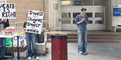
After analyzing the campaign posters of RyeSAC presidential candidates Carlos Flores and Dave MacLean, Moran said MacLean’s sign, which features only his name in white letting behind a black background, is the most effect.
“Carlos Flores’ [poster] has his picture, shows when the date of the election is, it tells you what office he holds, what his policy is and everything else, but that’s not something you usually do on a sign,” says Moran. “[Flores] looks like a neat and clean young man and he’s got good policies, but when people look at a sign they don’t expect to be educated.”
It seems Ryerson students are down with dumb-downed signs as well.
“It’s time consuming to read a sign with a bunch of info,” says first-year retail management student Stephanie Santos. “If you have just the name it gets people aware of who the candidates are.”
A minimalist approach led to multiple wins for former RyeSAC president Paul Cheevers, who was also elected to the Board of Governors six times in addition to his presidential win during the mid – ‘90s.
“I tried to limit my posters to having only five words,” says Cheevers, a radio and television arts graduate. “All I put on my posters was my picture, my slogan and I made sure my name was very visible.”
MacLean’s decision not to make his last name more visible was Moran’s main criticism to the commerce society president’s poster.
“Both the Dave and the MacLean are the same height –you don’t ever do that,” says Moran. “The last name is the one that has got to be enlarged … Voters don’t care if [your first name is] Carl or Carly or Charlie – they don’t even remember, but the last name is what they’re looking for.”
Moran says MacLean could also improve his posters by taking the white out of them.
“Use a yellow Hi-Liter to fill in the white letting on MacLean so it jumps out at you,” says Moran. “That would make a world of difference.”
While less is more when creating a sign, Cheevers says posters are best in bulk.
During his 1995-96 presidential campaign, Cheevers put up more than 6,000 posters throughout Ryerson.
This year, both presidential candidates say campaign signs are a good way to clue students in about their campaigns, but Flores says that talking to voters is the secret to success.
“The most important thing is meeting with people one on one” says Flores, the current vice president academic.
Last weekend, MacLean and his running mates put up additional posters that feature his platform, picture and the election dates.
MacLean’s new posters are a change of pace, but not necessarily a change for the better.
“I’ve seen candidates who cover everything on their signs, but nobody voted for them,” says Moran. “Don’t worry about the extra info, let the press tell the people when to vote.”
On that note: RyeSAC voting takes place Feb. 9, 10 and 11.


Leave a Reply